Form field types and settings
This reference lists each Form Designer element by exact palette name so you can find settings quickly. Open Form Elements on the left of the designer: Basic and Widgets tabs.
Editing a definition needs a Tenant Admin or Manager seat. Contributors use these fields when filling submissions.
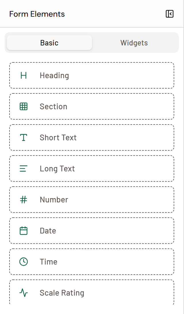
Basic fields
Heading
Display-only title on the form. Settings include text size and alignment.
Section
Groups fields into a layout section with its own rows.
Short Text
Single-line text. Common settings: Field Label, placeholder, default value, max length, required, read-only.
Long Text
Multi-line text. Same family of label and validation settings as Short Text.
Number
Numeric entry. Supports placeholder and validation-style limits in Properties.
Date
Date picker. Format options such as MM/DD/YYYY; fixed default when configured.
Time
Time entry; 12-hour or 24-hour format.
Scale Rating
Selectable numeric scale (step count).
Spinner
Increment/decrement numeric control.
Submit
Submit control on the canvas.
Multiple Choice
Multi-select choices.
Single Choice
Single-select choices.
Dropdown
Select from a list.
People Picker
Pick team members on the project.
Widgets
Form Calculation
Build a formula with the Formula tab (field tokens, + - * /, and the built-in function list only: abs, min, max, round, ceil, floor, pow, sqrt, avg, avgNoZero, sum, countNonEmpty, count, today, addDays, subtractDays, dateString, commaSeparate). Options include Default Insert Mode (Numeric/Text), Result Field Is Read Only, Show Empty Decimal Places, Ignore Hidden Fields, Use Commas for Decimal Point, Decimal Places, Null Handling, and Error Handling. Settings include Field Label and Required. See Configure a Form Calculation for recipes such as addDays(DateField, 3).
Configurable List
Repeating table. Configure Rows, Columns, column types (Radio Button, Checkbox, Dropdown, Textbox, Numeric, Currency), Add Button Label, Allow Row Deletion. See Configure a Configurable List.
Task List
Tracked checklist of items with status, assignee, due date, photos, and optional drawing pins. Not the same as Configurable List (which is a repeating table of free-form columns). Punch list, Safety observation, and Action items use a Task List; you can add one to a custom form too. See Using Task Lists.
Multiple Text Fields
Several related text inputs in one widget.
Terms & Conditions
Acceptance text and acknowledgment.
Checklist
Checklist items for pass/fail style capture.
Dynamic Textbox
Text input with dynamic behavior options.
Data Grid
Tabular data grid widget (palette label Data Grid).
Weather Widget
Weather capture widget (palette label Weather Widget).
GPS Location
Capture location on device.
Barcode/QR Scanner
Scan barcode or QR values.
File Attachment
Attach files to the submission.
Signature
Capture a signature.
Image Upload
Photo attach with optional freehand pen markup and layers. See Configure an Image Upload field.
Document Register Link
Link register documents into the submission.
Form Link
Link related forms.
External Recipients
Collect external recipient rows for distribution-style flows.
Acknowledgment
Acknowledgment capture element.
Document Distribution
Document distribution element for packaged sends.
Conditions and visibility
Use Show/Hide Field conditions to show or hide targets from another field's value or from Workflow Status on submitted items. Target a Section to hide every field inside it at once. See Show or hide fields with conditions.
Editing after submissions exist
See What happens when you edit a form that already has submissions.